At the recent RWAustralia and RWNew Zealand romance writers' conferences I had the pleasure of talking about books (as you do) with people during the morning and afternoon tea sessions. Sharing information about new books purchased, recommending favourite authors, arguing about the best genre, anything and everything was fair game.
And one of the topics that came up time and again was, what sort of book covers appeal to you (as a reader not writer)?
Both conferences had a bookstore present - Dymocks and Barbara's Books, and with a huge range of covers to peruse, we debated the merits of those that appealed and those that didn't, and why. It was interesting to see what caught someone's attention.
Some liked having just the hero on the cover. Others preferred the headless hero or heroine (leaving the actual facial appearance to the imagination of the reader). Clothing, body positions, backgrounds, detail, settings, author's name placement, title choice, colours, sizing of text ... a myriad of issues and the merits of each element were discussed.
It got me thinking about the book covers of authors I have on my bookshelf. One of the thing I love doing is sitting down in front of them and pulling out my favourite covers (not stories - that's another post).
So, I thought I'd share a half dozen or so of the covers that appeal to me by the element that most appealed or drew me to the book (excuse me if I invent a Kylie'ism/term to convey the concept).
Colour:

It's all about colour appeal here. These all have a dominate colour (or shades of the same) reflected on the cover.

Placed face out on the bookshelf, all these books would draw your eye to them - UNTOUCHED (Anna Campbell) and LOVER MINE (J.R.Ward), in particular.
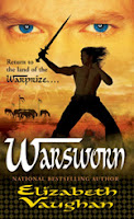
SONG OF SCARABAEUS (Sara Creasy) and WARSWORN (Elizabeth Vaughan) have solid colours too, but they also have a certain amount of detail that makes you look again, this time for elements of the story.
Guy Appeal:
(looks like I have a think for the warrior types not to mention a back view of their shoulders, eh?)

I remember seeing Helen Kirkman's FORBIDDEN on a large poster at one of my earliest RWAustralia conferences and I bought it based on that alone (I was NOT a reader of historical romance then).
Denise Rossetti's THE LONE WARRIOR has another hot warrior type but I also like it for the amount of intricate detail within the picture. It has pieces of the story and the hero's character woven into it.

TUCKER'S CLAIM (Sarah McCarthy) was one I bought from Barbara's Books at the RWNZ conference, only the cover didn't have the blue border around the edge.
It featured only the bare chested hero. What grabbed me was the chest with leather vest, but also the bracelet and necklace he was wearing.
I'm a sucker for a Native American Indian hero (and yes, it's confirmed that I definitely have a thing for the warrior-hero types - LOL).
Visual Detail (characters & background):
While there's an enormous amount of detail in the characters and the backgrounds of these book covers, neither are overwhelmed by it.

NIGHT'S COLD KISS, Tracey O'Hara's incredible cover, kept me looking for long minutes as I checked out the heroine, her clothing, her body position, her weapon, then my eye was drawn to the background and the details there.
The monotone-like colours made it easy to distinguish detail but conveyed the mood/tone of the book as well.
 Christina Phillip's FORBIDDEN is stunning. This is a veritable feast for the eyes and for those who love the ancient historical time period.
Just check out the amount of detail in the clothes, the armor, the jewellery worn by the characters. Then take a close look at the background - it's incredible too.
Genre/Style:
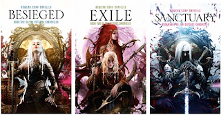
I love the artist's style in Rowena Corey Daniells' series. The detail, the colours, the connection of the titles - all scream 'fantasy' and world-building in a big way.
So what appeals to you as a reader when you chose a book? Do you chose a book solely based around the author's name?
What if you discover a new author? Is it the cover or blurb that attracts you first? What turns you off?
What draws you into picking up a book?


Hi Kylie - as I'm buying more e-books now with my kindle, I tend to buy off reviews and blurbs. I won't buy an e-book now without reading the sample pages to see if I like the voice.
ReplyDeleteBut a cover is important if I'm flicking through RT Book Review magazine, or email newsletter, or on a website. If it's attractive I'll stop and look at the blurb, reviews and sample pages. But I won't buy off just the cover.
Author's name is a big factor to me, so that's usually the first point of call. I think cover art can tip me into picking up a book by an unknown to me author. I'm a visual person and so it does attract me. But will it be the sole reason for buying a book - no. I'll read the blurb and then make my decision from there.
ReplyDeleteJust love the covers.
If I'm browsing for a new book/author (airport shops are my nemesis...) then the cover will always attract me first. Then I read the back cover blurb and if that sounds ok I'll read the first couple of pages. If it's still looking interesting then I'll buy.
ReplyDeleteI buy most books on author's name or recommendation so in that case I'll appreciate the cover but it wont have an impact on whether I buy or not!!
Covers definitely make me buy the book. Once I saw MJ Scott's Shadow Kin and Kristen Pianters Blood Rights, I knew I had to have them, based on the covers alone. The blurb only confirmed it. Of course, this only happens some of the time, as I would seriously blow my budget if I worked on this theory alone. But if it catches my eye, its more likely to make me pick up a debut author.
ReplyDeleteI must admit, with all the ebooks out there, I'm finding lately, most of them have beautiful, stunning covers, and then some of the traditionally pubbed have fairly plain/sometimes ugly ones. Wondering about this.
Fingers crossed I get a beautiful one!